PRESERVE
PRESERVE
Preserve is an app that allows users to better their understanding about environmental conservation. The app serves as a one-stop platform for information, community building, and action, with a primary focus on the preservation of endangered plant species.
The Problem
Users interested in plant conservation often lack accessible tools, resources, and guidance. The app serves as a resource hub offering identification tools, guides, and expert insights.
User Research Summary
Through user interviews, surveys, and feedback collection, I gained valuable insights into the needs, preferences, and challenges that needed to be resolved. Users expressed a genuine interest in community building, data contribution, and hands-on involvement in conservation projects. This user research has guided the app's design and feature development, ensuring that it aligns with the real-world needs of plant enthusiasts, conservationists, and those passionate about preserving endangered plants.
Pain Points
Skill Level
Time
Insufficient
Instructions
If the app fails to offer engaging content or interactive features, users may lose interest over time.
Users may find the app's interface and features complex or difficult to navigate, making it challenging to access the information they need.
Users may feel overwhelmed by the amount of information presented in the app, making it difficult to focus on what's most important.
Survey
I conducted a survey to gather information on participants knowledge and value of endangered plant species.
of respondents expressed interest in participating in workshops or events related to endangered plants and conservation.
70%
believed it's important to protect and conserve endangered plant species.
90%
of those aware of endangered plants in their region could name at least one specific endangered plant species.
70%
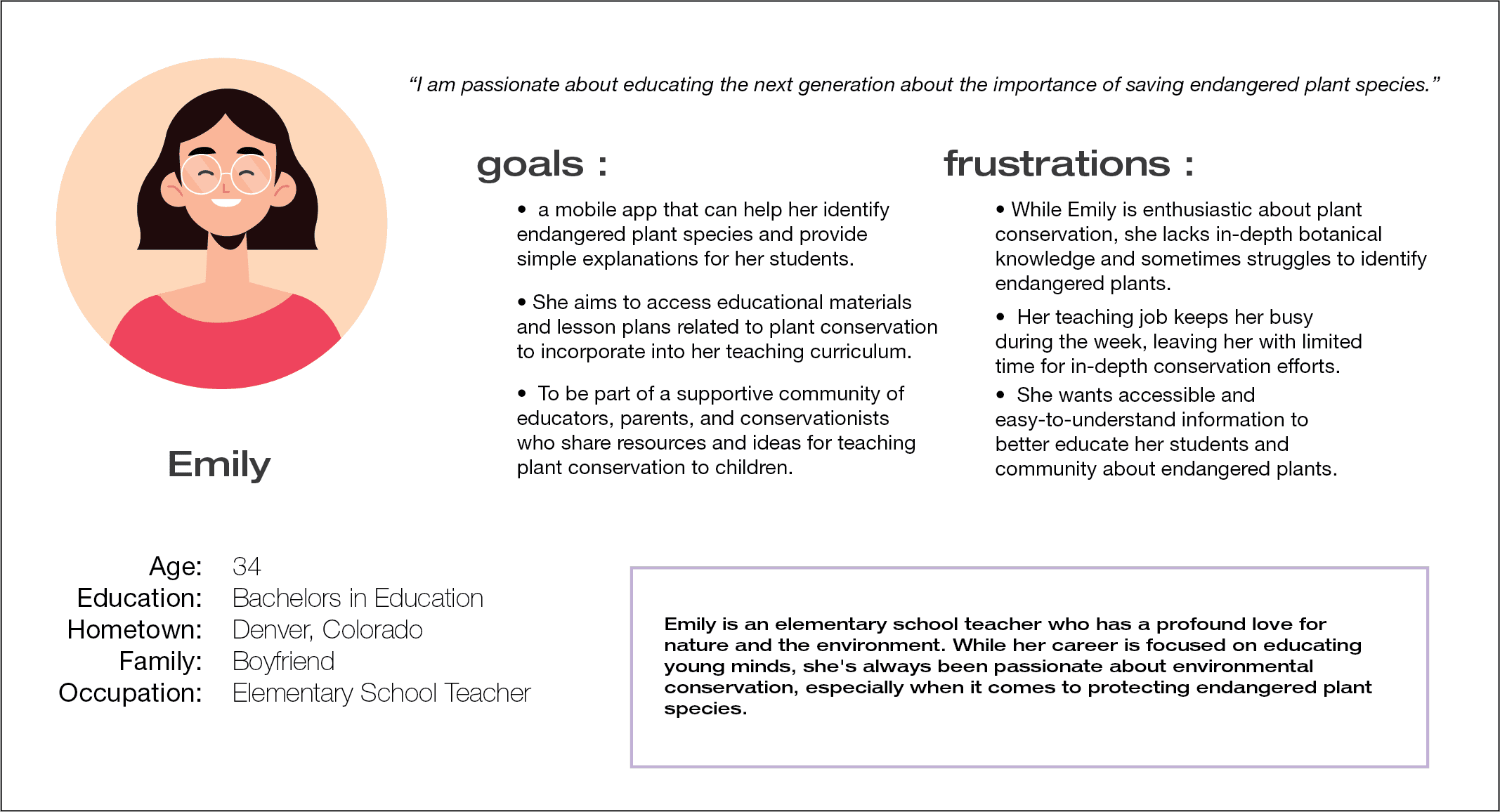
Persona 1
Problem statement:
Emily is a busy Elementary School Teacher who needs an easy way to learn about endangered plant species
because she teaches her students about the plants on her class walks.
Persona 2
Problem statement:
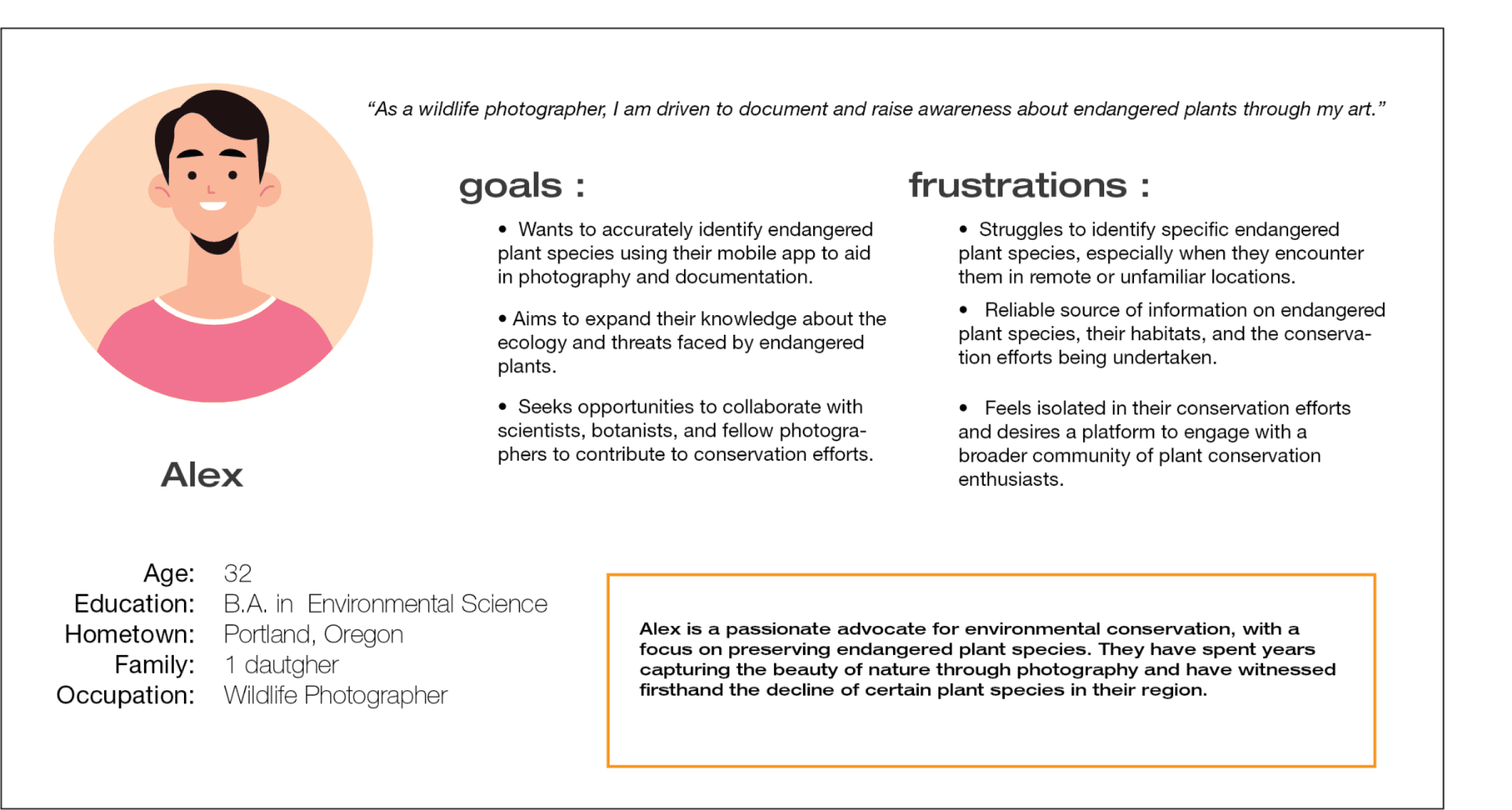
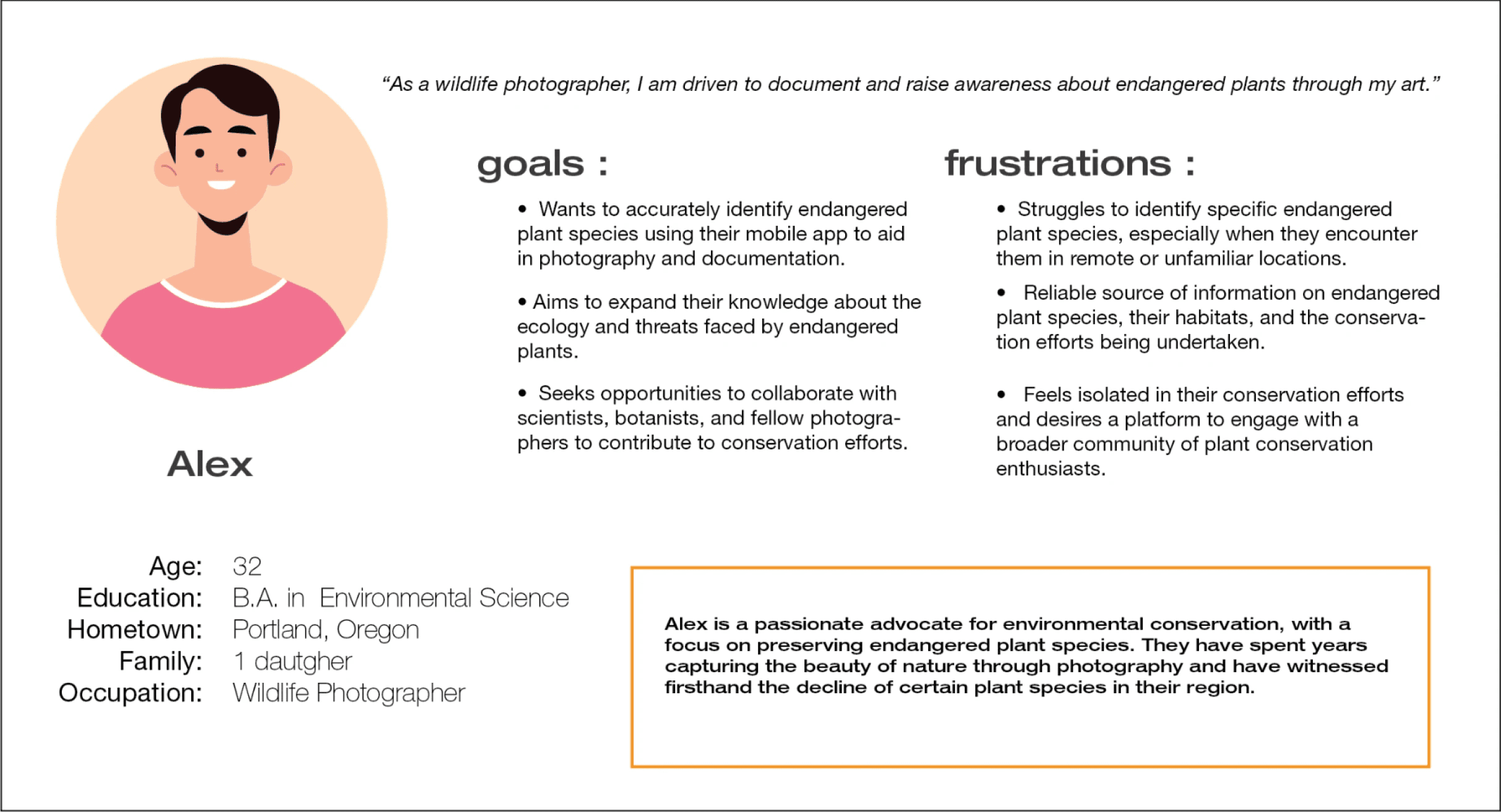
Alex is a passionate environmentalist
who needs a way to share his findings about plants because he wants other people to know the importance of preservation.
Starting the Design
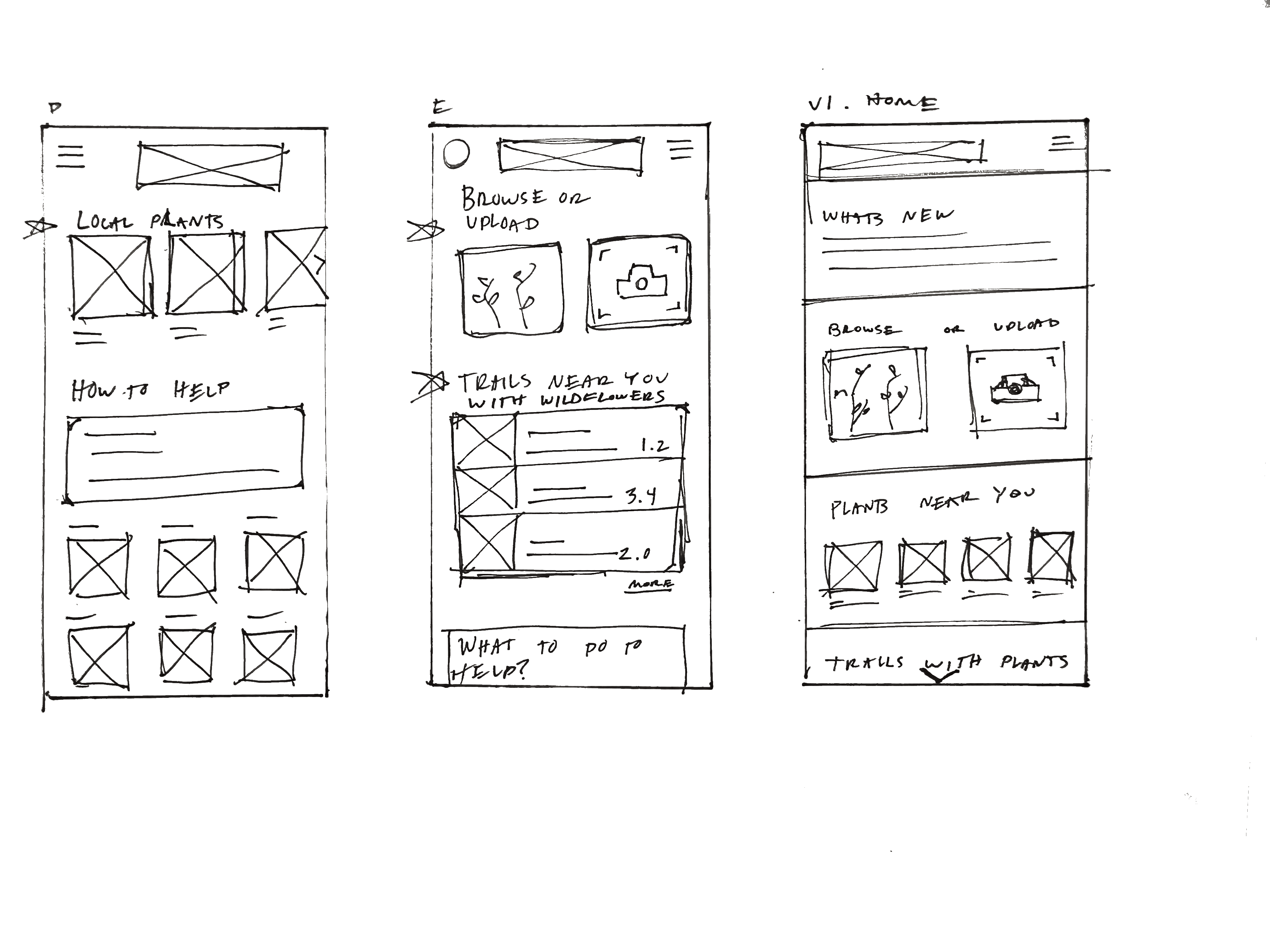
I chose to do the crazy eights method to identify to get a better understanding of the process a user would go through while using this app.
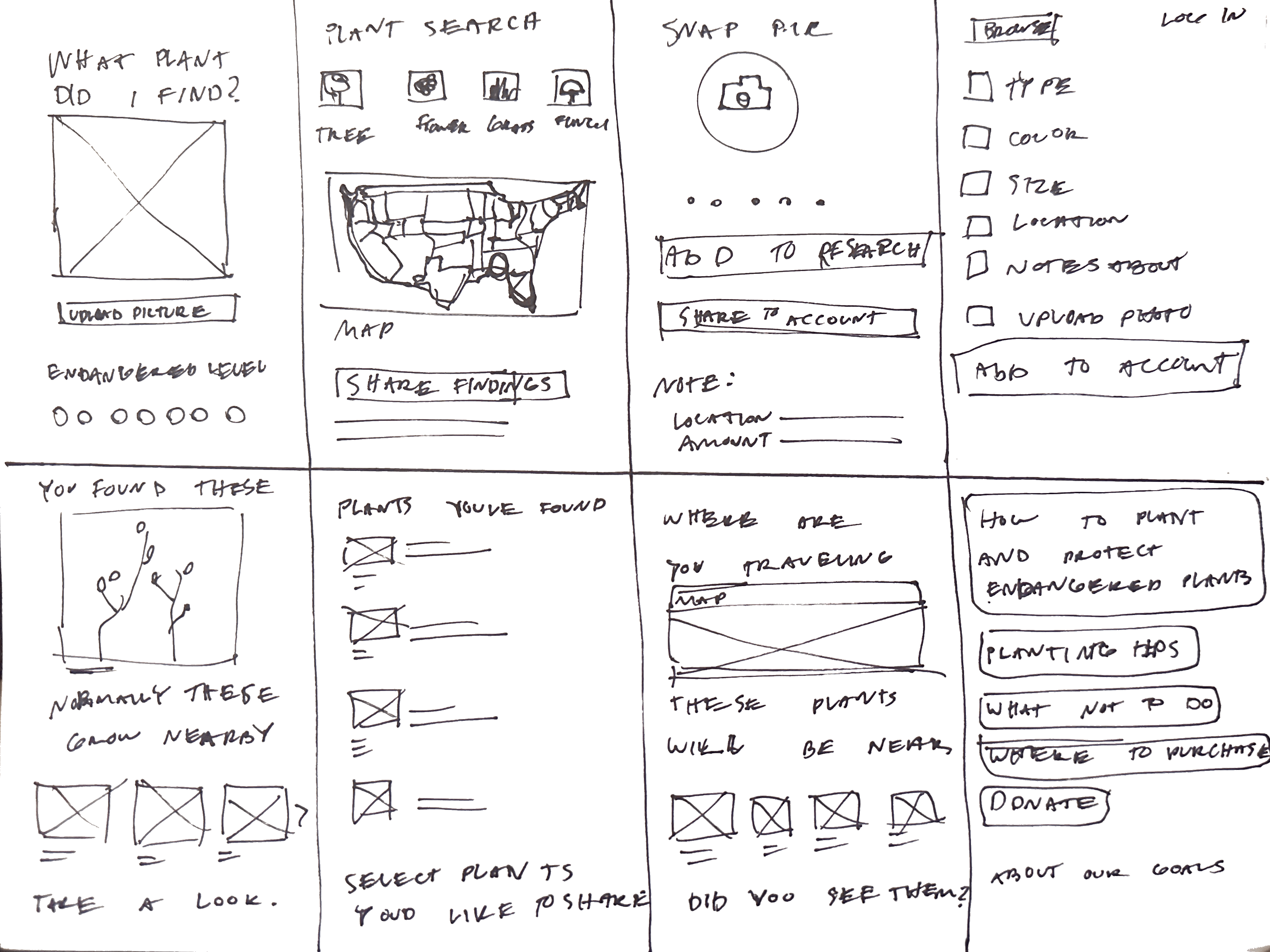
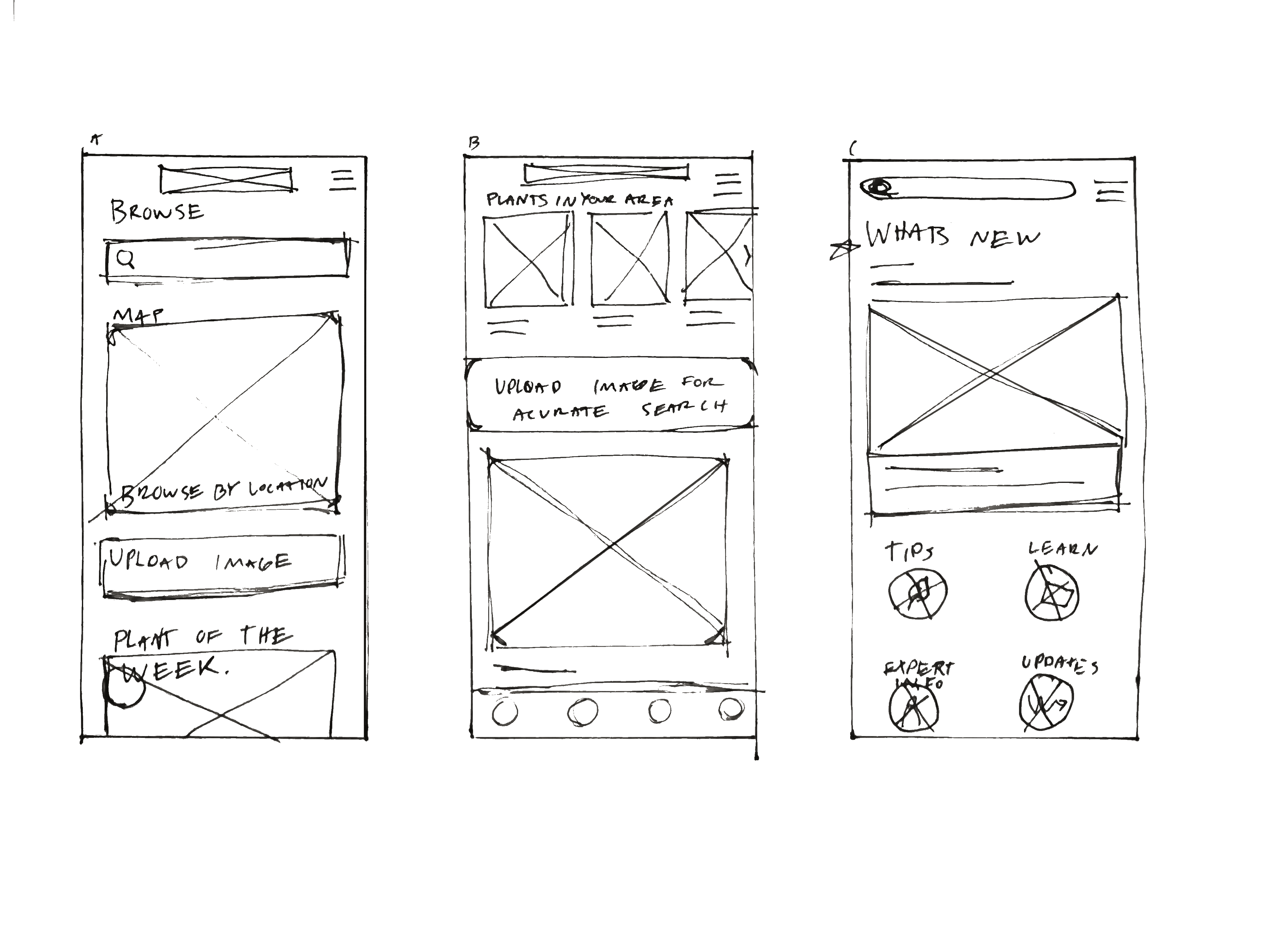
I creating paper wireframes, these helped me get a better understanding of my ideas. getting them from ideas in my mind to real paper wireframes helped with eliminating concepts and finding parts that I would apply to future concepts.
Digital Wireframes for Mobile
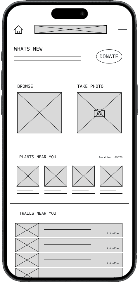
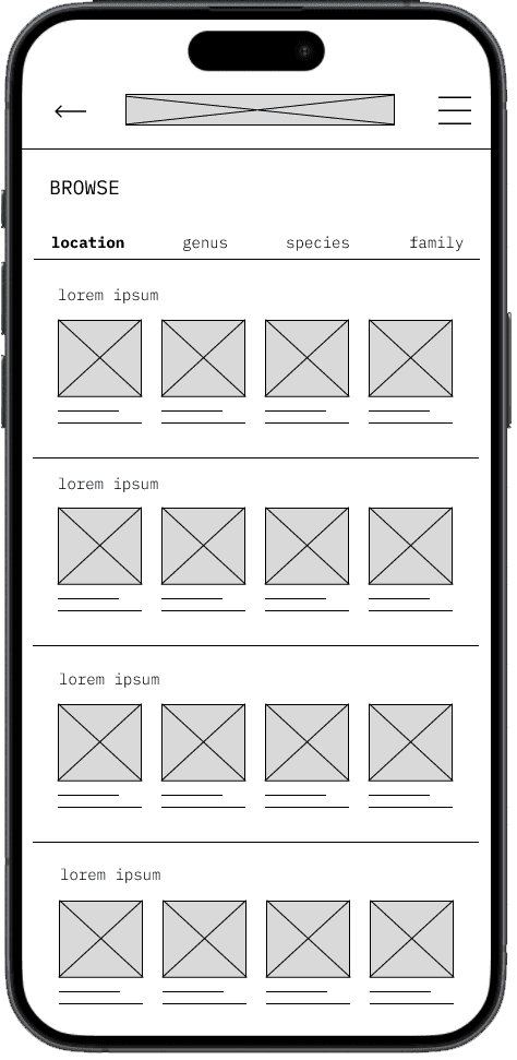
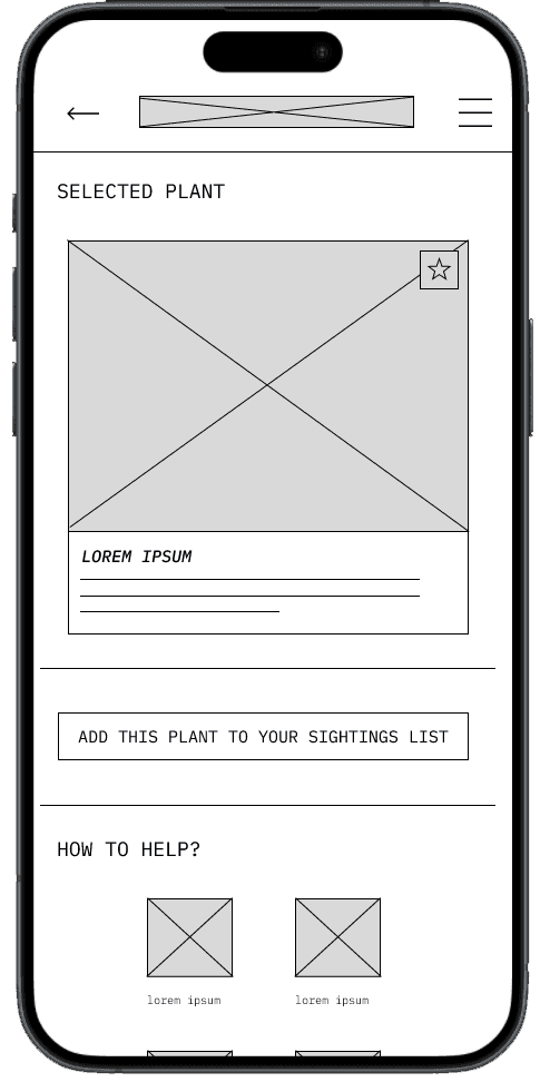
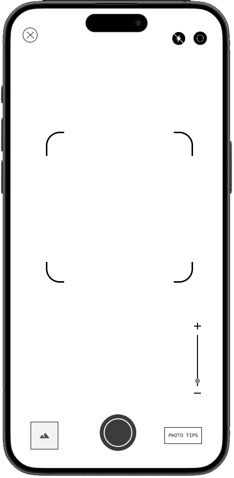
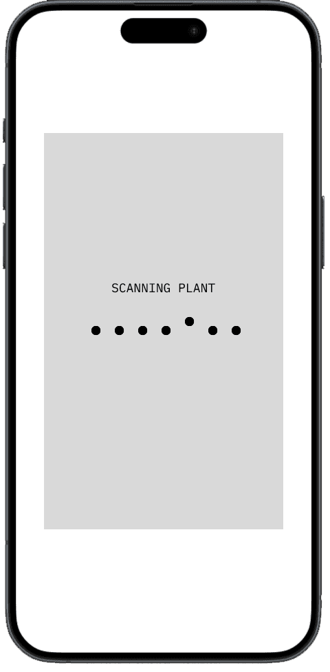
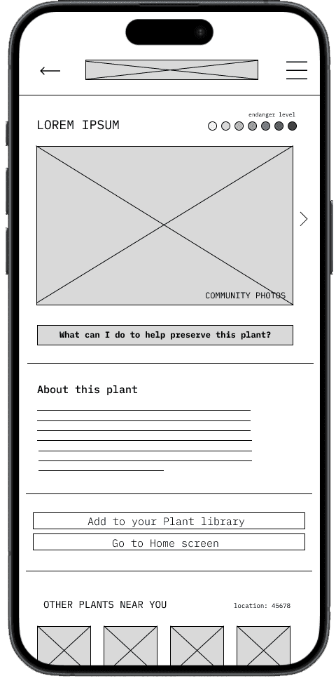
After Ideating and sketching multiple paper wireframes, I started to design my first digital versions of my Preserve App. These designs focused on allowing the user to complete the task of identifying a plant and adding it to their own personal list of plants.
Low-Fi Prototype
To prepare for the user testing, I created multiple screens that made up the basic flow of the app. This flows goal was to test the fluidity and ease of use.
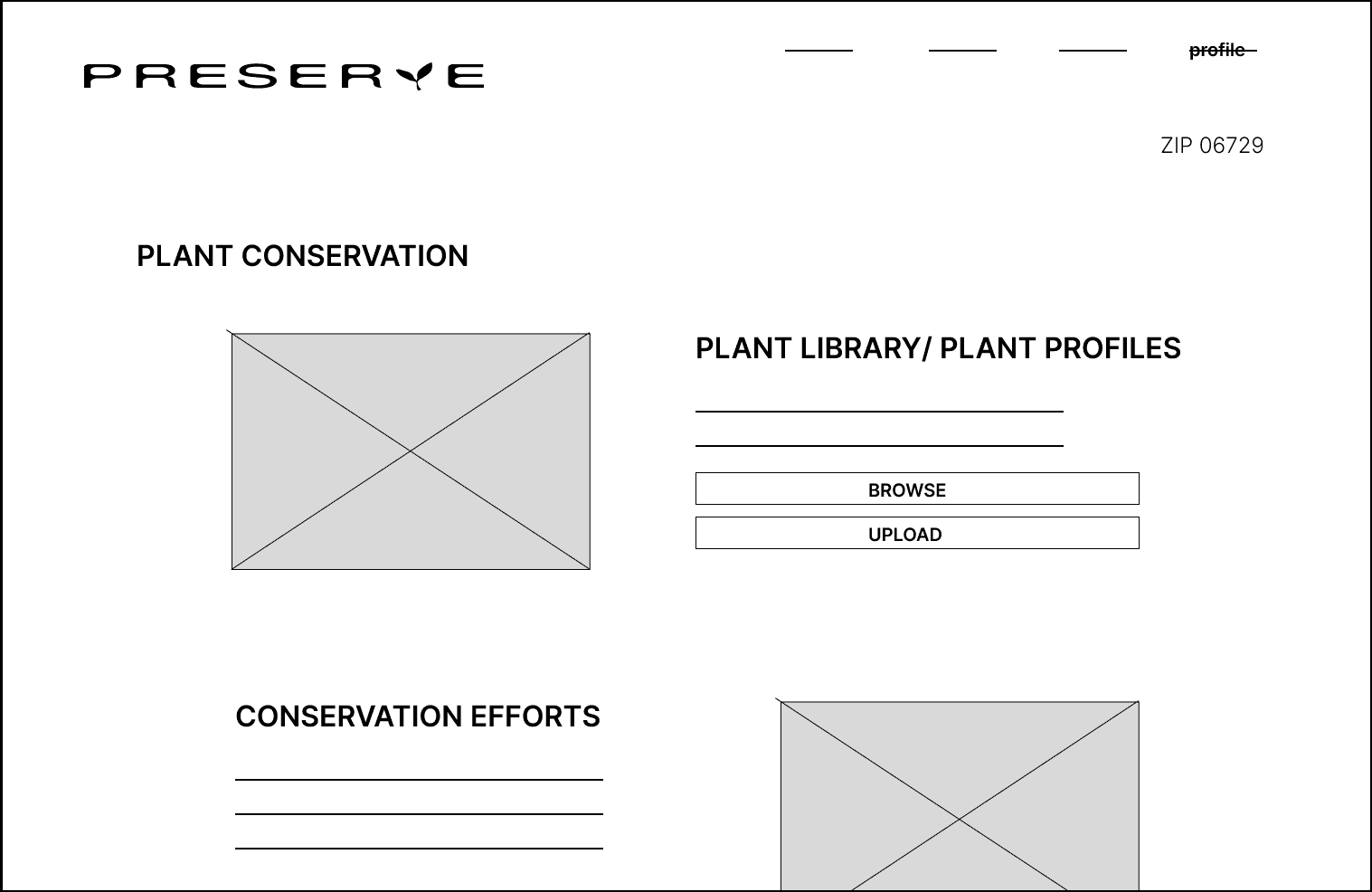
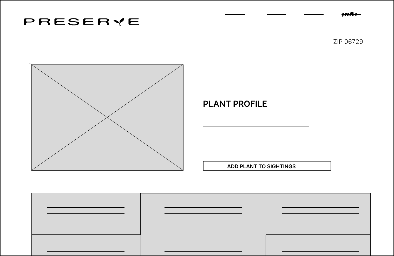
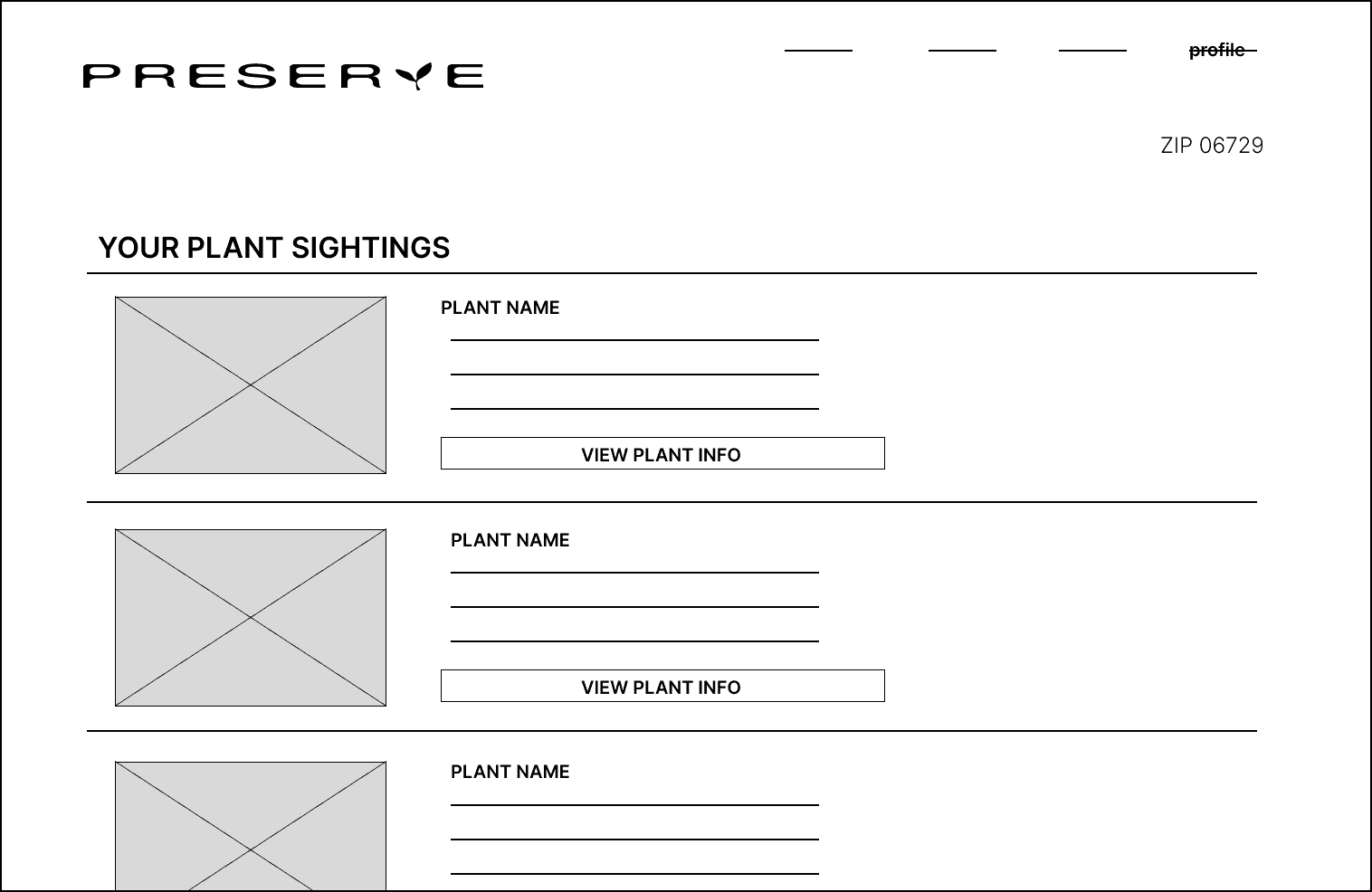
Digital Wireframes for Web
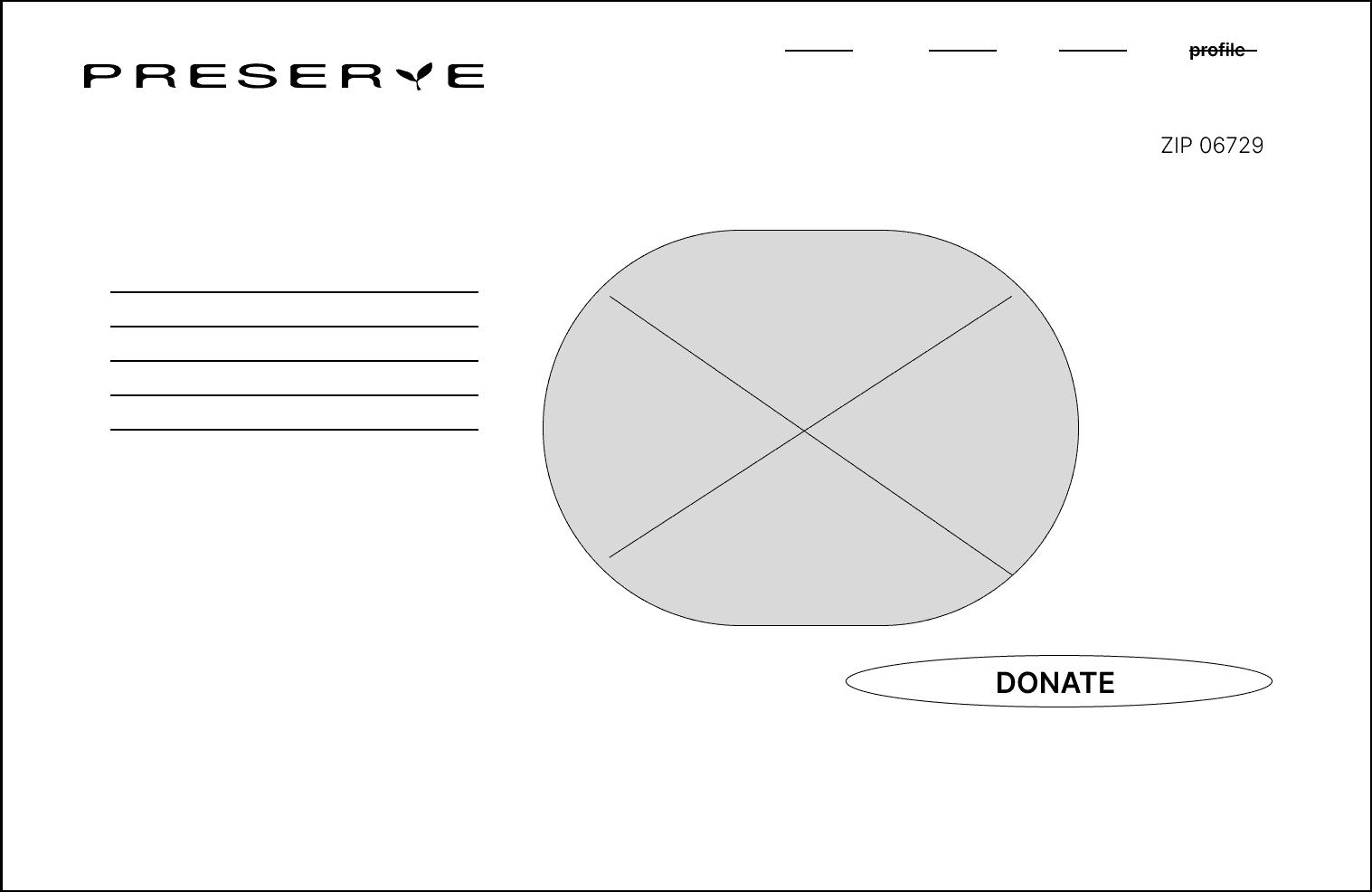
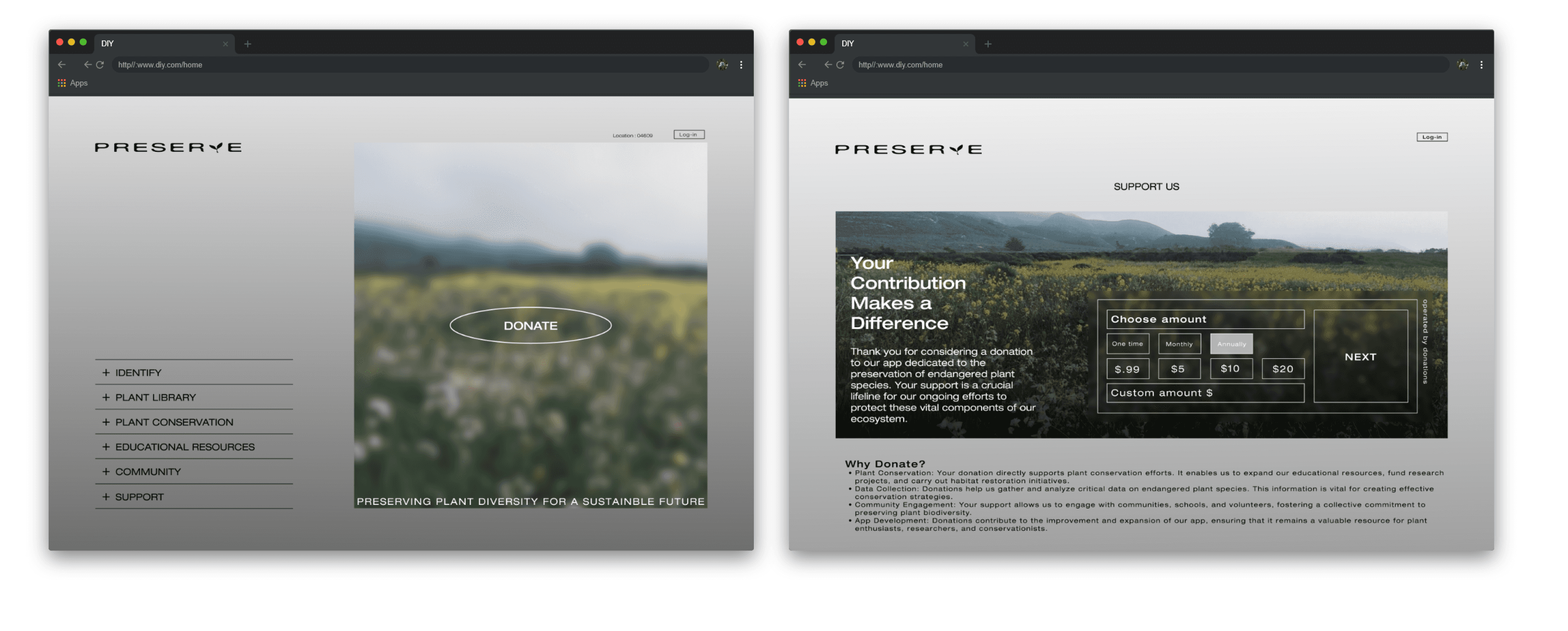
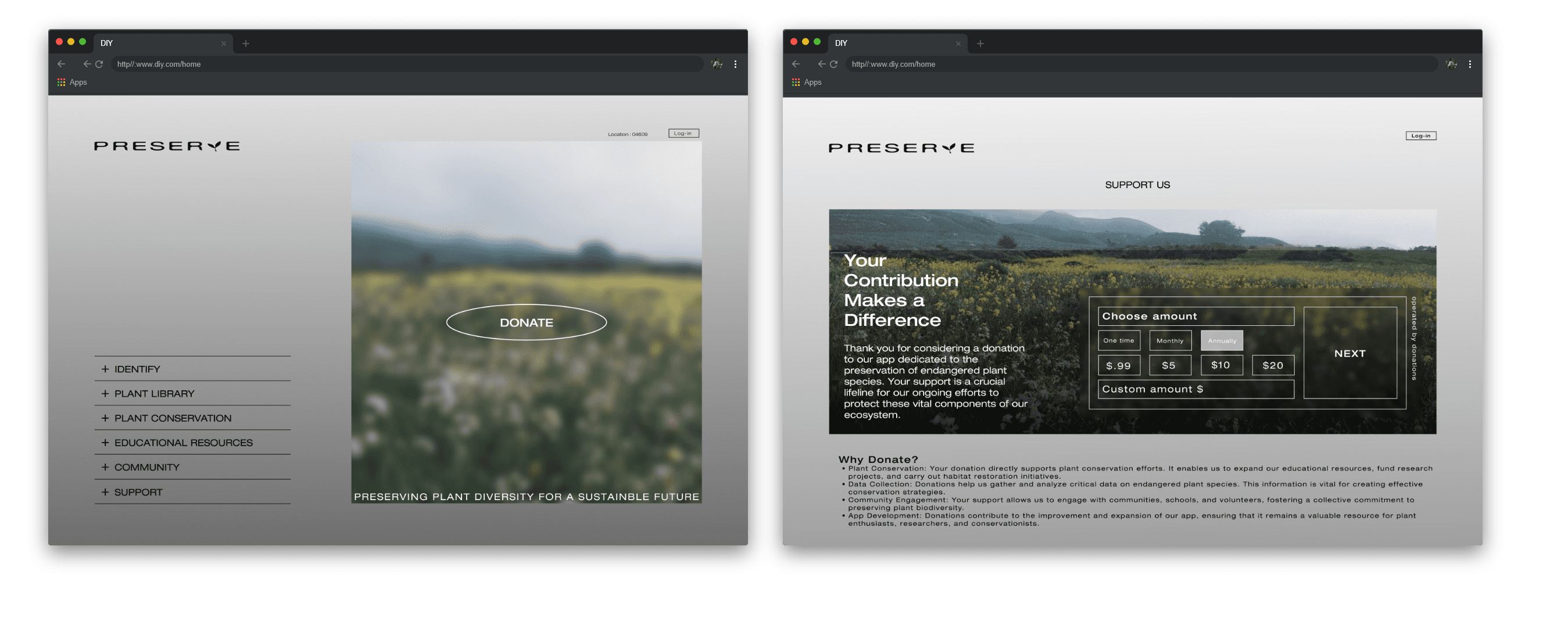
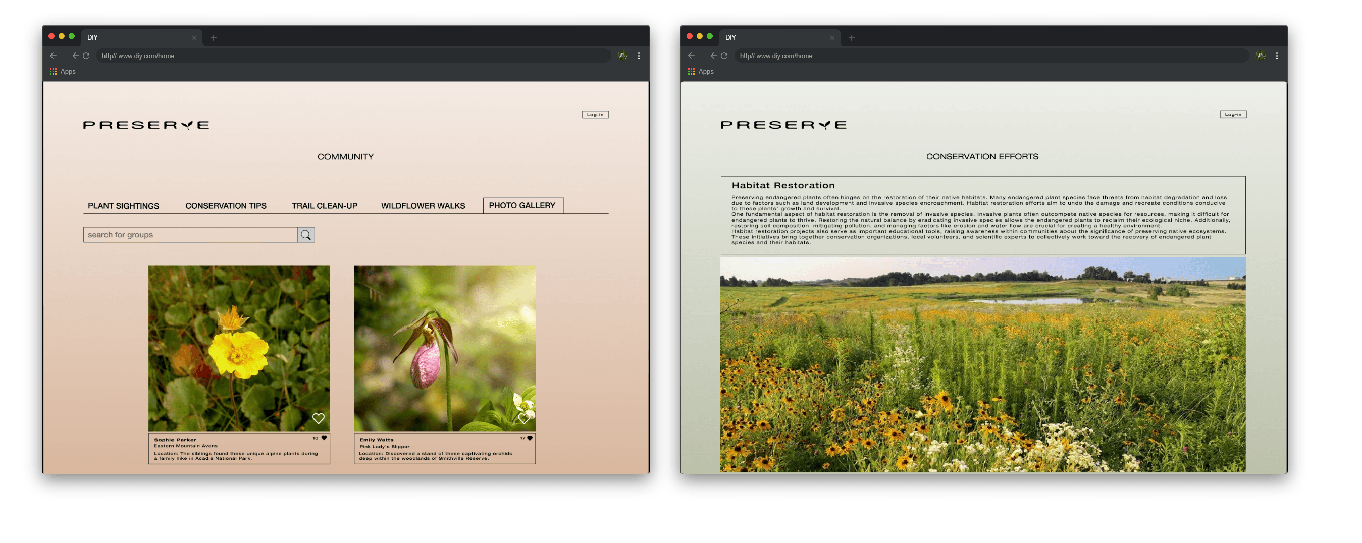
After creating my mobile app wireframes I went on to start creating the website wireframes for the Preserve site.
Usability Study Findings
Add Community Feature
Better Uploading System
Add a Filter Option
Majority of users wanted to be able to see what plants people nearby were finding, and they wanted to get updates on events.
Need to correct the flow of the upload a plant feature.
Allowing users to filter through plants that need more care than others
Mobile Mockups
High-Fi Prototype Mobile
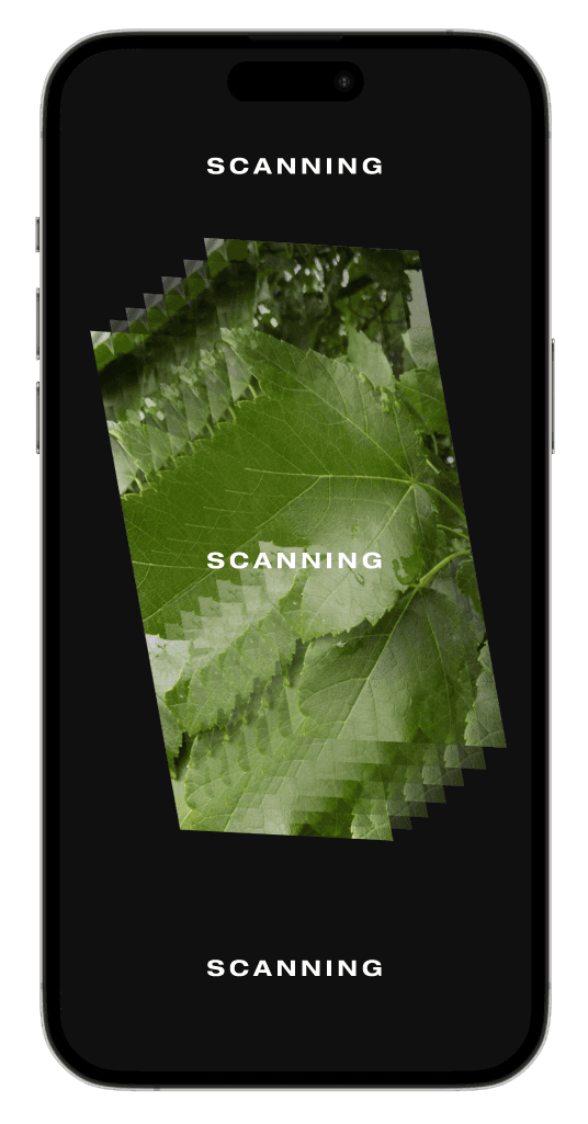
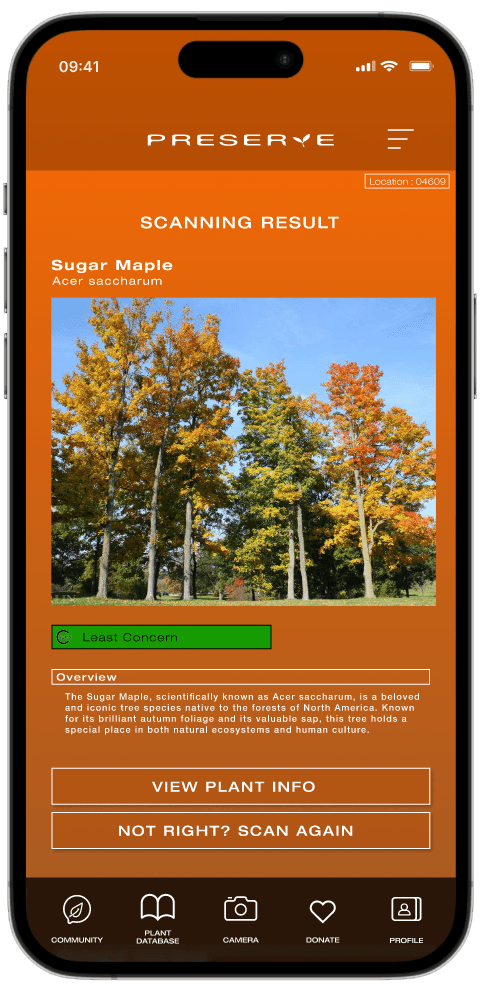
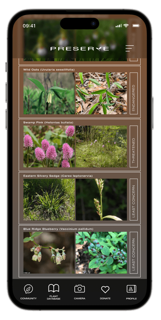
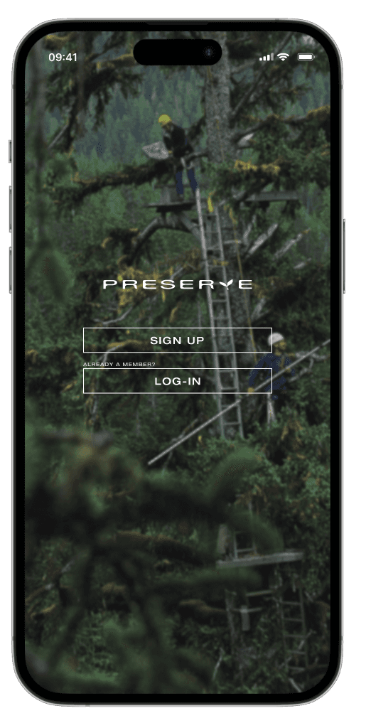
The high-fidelity prototype followed the same flow as the low fidelity prototype but has many additional features and changes that were made after the usability study.
Web Mockups
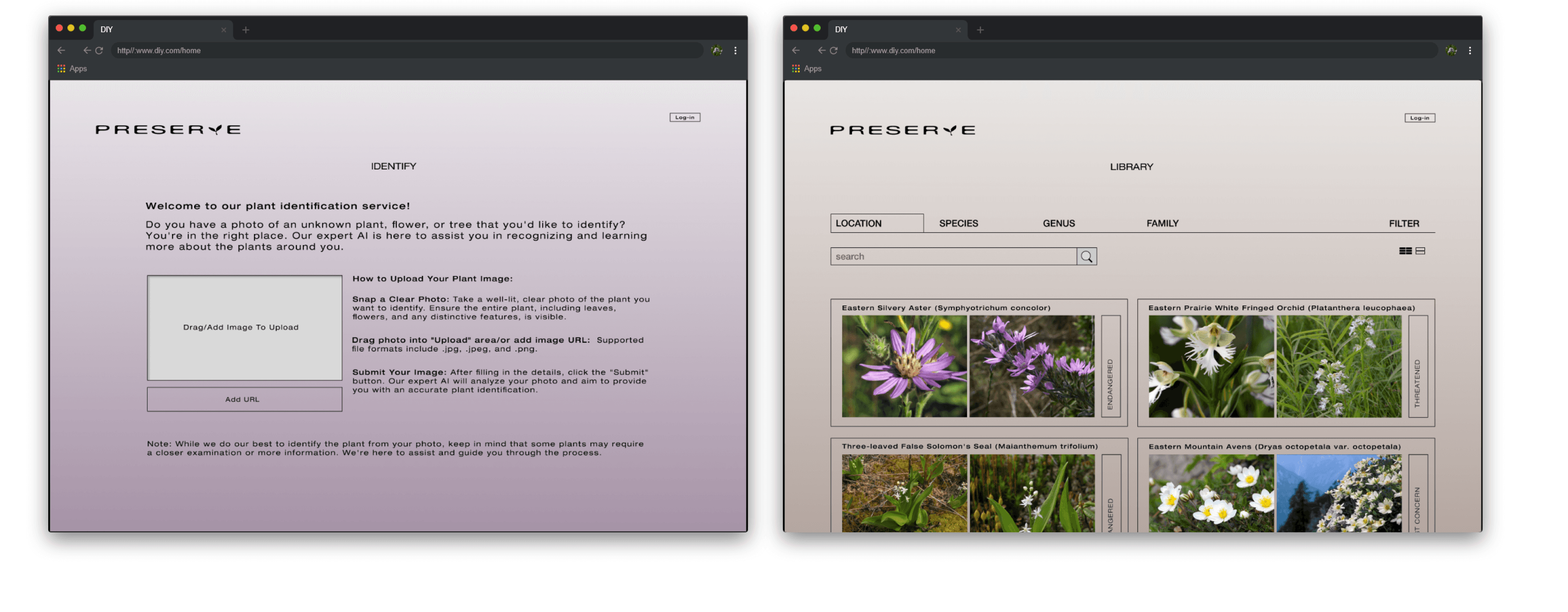
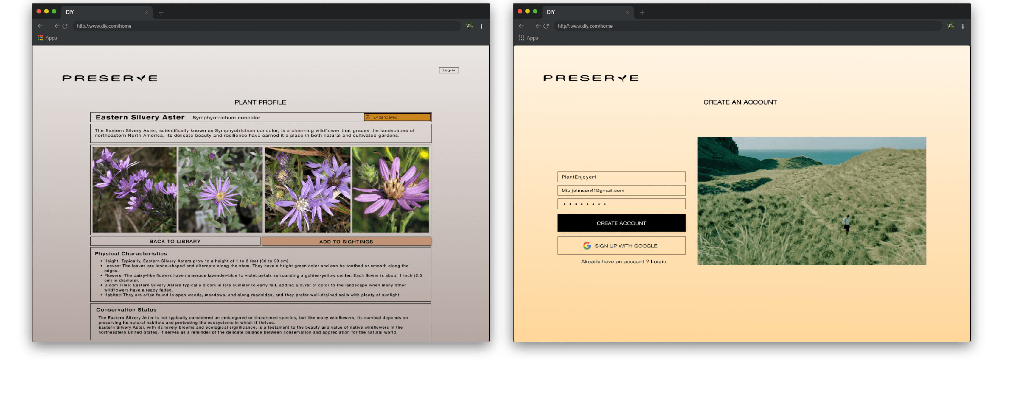
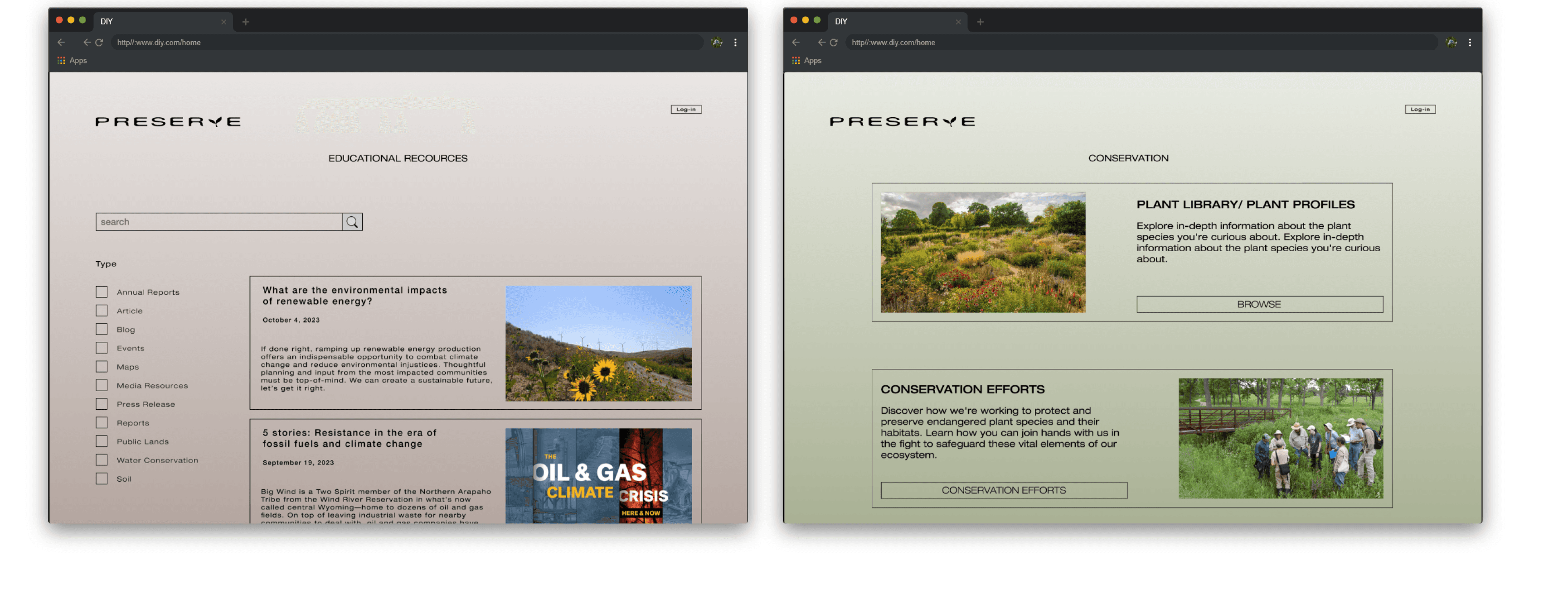
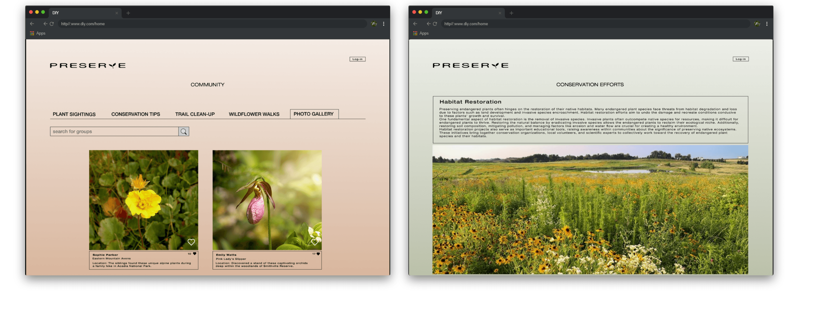
High-Fi Prototype Web
Takeaways
Users Shared that the app helped inform them about the importance of preserving plants, while also educating them on different plant species.
One quote from peer feedback:
“The Preserve app makes learning about plants enjoyable and interesting, and I can't wait to do my part in helping preserve plants.”
What I learned:
I learned that although the problem was a global issue, that going through each step in the design process allowed for me to pinpoint specific issues and desires from users and apply them to an app and a website.
Affinity Diagram
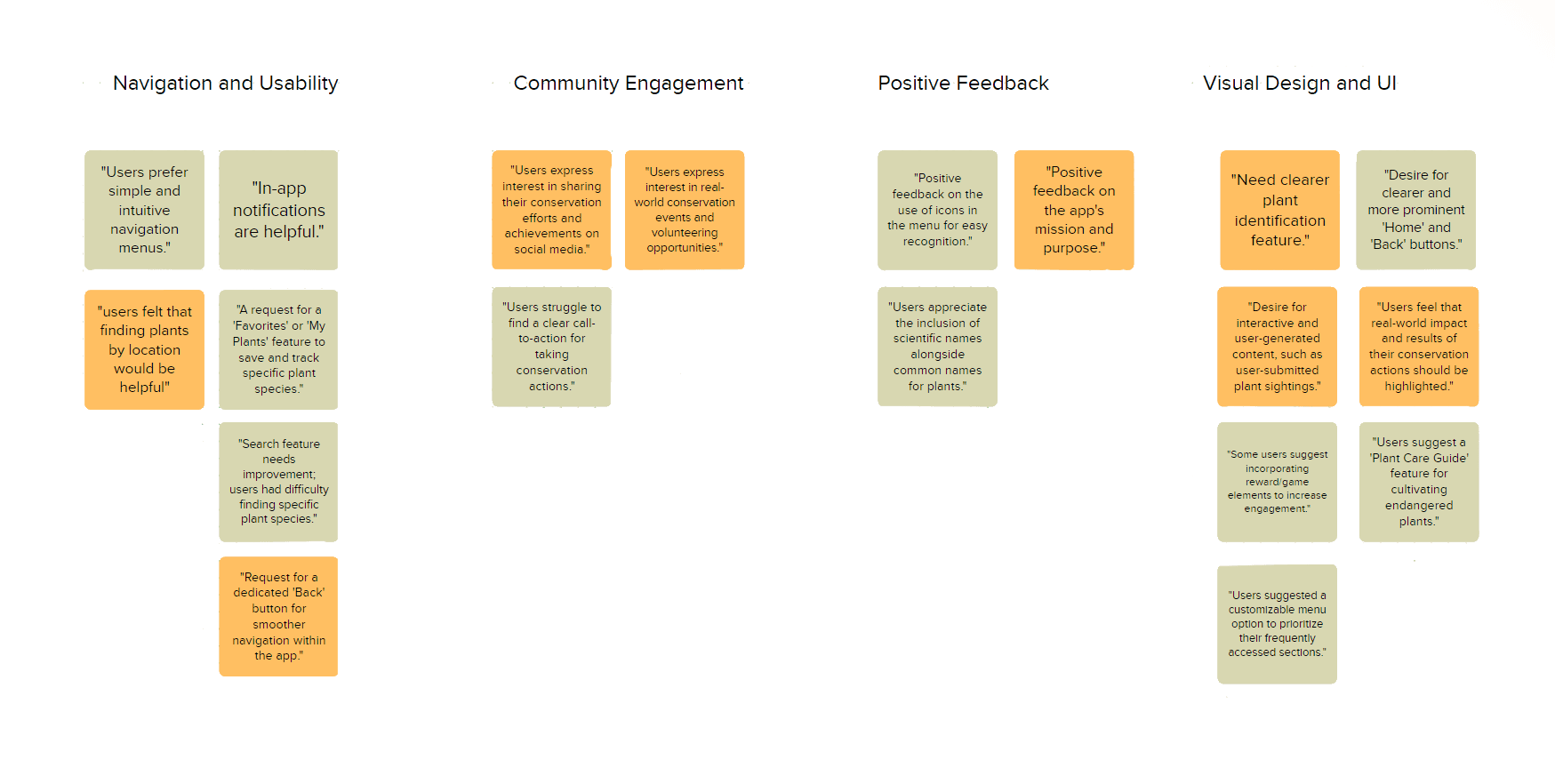
The affinity diagram helped organize the data from the usability testing, This identified key sticking points that the users were experiencing.
Refining the Design
Before Usability Study
After Usability Study
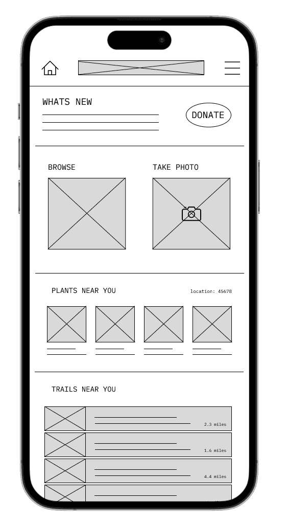
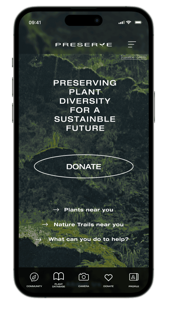
After conducting the usability study, I was able to take my findings and apply them to the mockup home screen. I created the option to have access to majority of the users needs at the bottom of the home screen.
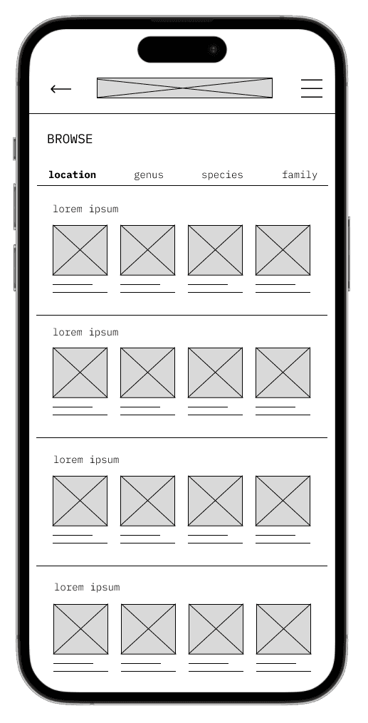
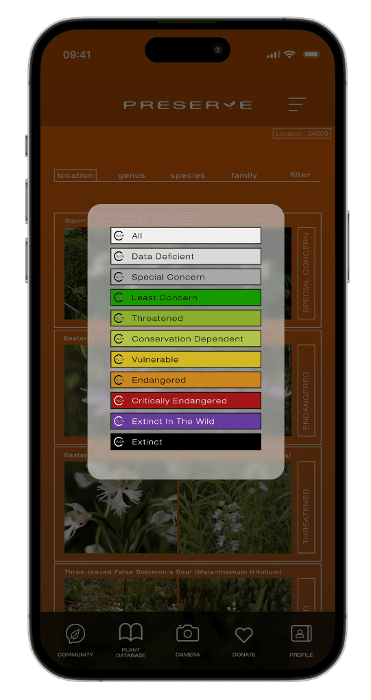
Other changes I made to my design included providing a filter area for users to select and view plants listed in different threat levels.
Preserve is an app that allows users to better their understanding about environmental conservation. The app serves as a one-stop platform for information, community building, and action, with a primary focus on the preservation of endangered plant species.
The Problem
Users interested in plant conservation often lack accessible tools, resources, and guidance. The app serves as a resource hub offering identification tools, guides, and expert insights.
User Research Summary
Through user interviews, surveys, and feedback collection, I gained valuable insights into the needs, preferences, and challenges that needed to be resolved. Users expressed a genuine interest in community building, data contribution, and hands-on involvement in conservation projects. This user research has guided the app's design and feature development, ensuring that it aligns with the real-world needs of plant enthusiasts, conservationists, and those passionate about preserving endangered plants.
Skill Level
If the app fails to offer engaging content or interactive features, users may lose interest over time.
Pain Points
Time
Users may find the app's interface and features complex or difficult to navigate, making it challenging to access the information they need.
Insufficient Instructions
Users may feel overwhelmed by the amount of information presented in the app, making it difficult to focus on what's most important.
Survey
I conducted a survey to gather information on participants knowledge and value of endangered plant species.
of respondents expressed interest in participating in workshops or events related to endangered plants and conservation.
70%
believed it's important to protect and conserve endangered plant species.
90%
of those aware of endangered plants in their region could name at least one specific endangered plant species.
70%

Persona 1
Problem statement:
Emily is a busy Elementary School Teacher who needs an easy way to learn about endangered plant species
because she teaches her students about the plants on her class walks.
Persona 2
Problem statement:
Alex is a passionate environmentalist
who needs a way to share his findings about plants because he wants other people to know the importance of preservation
Starting the Design

I chose to do the crazy eights method to identify to get a better understanding of the process a user would go through while using this app.
I creating paper wireframes, these helped me get a better understanding of my ideas. getting them from ideas in my mind to real paper wireframes helped with eliminating concepts and finding parts that I would apply to future concepts.


Digital Wireframes for Mobile
After Ideating and sketching multiple paper wireframes, I started to design my first digital versions of my Preserve App. These designs focused on allowing the user to complete the task of identifying a plant and adding it to their own personal list of plants.


Low-Fi Prototype
To prepare for the user testing, I created multiple screens that made up the basic flow of the app. This flows goal was to test the fluidity and ease of use.
Digital Wireframes for Web
After creating my mobile app wireframes I went on to start creating the website wireframes for the Preserve site.


Usability Study Findings
Add Community Feature
Better Uploading System
Add a Filter Option
Majority of users wanted to be able to see what plants people nearby were finding, and they wanted to get updates on events.
Need to correct the flow of the upload a plant feature.
Allowing users to filter through plants that need more care than others
Affinity Diagram

The affinity diagram helped organize the data from the usability testing, This identified key sticking points that the users were experiencing.
Refining the Design
Before Usability Study
After Usability Study


After conducting the usability study, I was able to take my findings and apply them to the mockup home screen. I created the option to have access to majority of the users needs at the bottom of the home screen.
Other changes I made to my design included providing a filter area for users to select and view plants listed in different threat levels.


Mobile Mockups


High-Fi Prototype Mobile
The high-fidelity prototype followed the same flow as the low fidelity prototype but has many additional features and changes that were made after the usability study.
Web Mockups
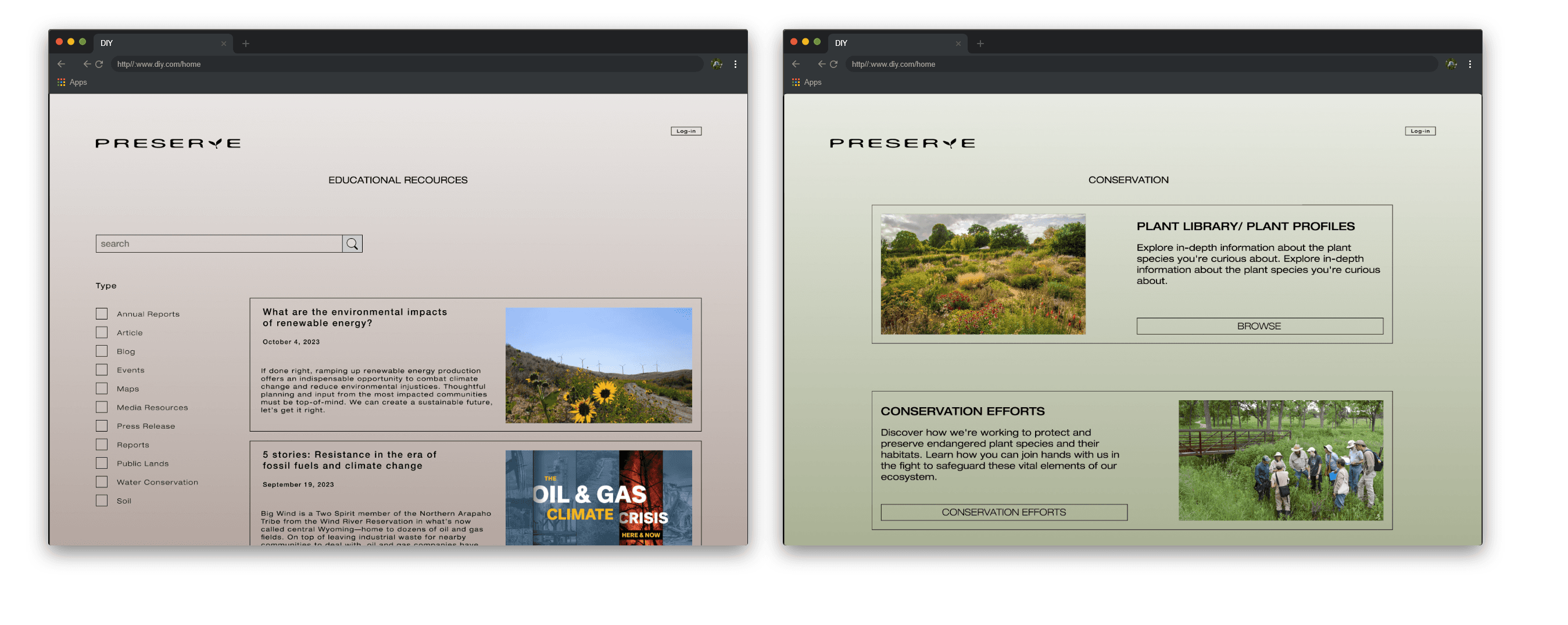

High-Fi Prototype Web
Takeaways
Users Shared that the app helped inform them about the importance of preserving plants, while also educating them on different plant species.
One quote from peer feedback:
“The Preserve app makes learning about plants enjoyable and interesting, and I can't wait to do my part in helping preserve plants.”
What I learned:
I learned that although the problem was a global issue, that going through each step in the design process allowed for me to pinpoint specific issues and desires from users and apply them to an app and a website.